Typography Task 1 / Exercises
07.04.2023 - 14.05.2023 (Week 1 - Week 6)
Sorcha Griselda / 0353056
Typography / Bachelor of Design in Creative Media / Taylor's University
Task 1:
Exercise 1 | Type Expression
Exercise 2 | Text Formatting
LECTURES
What is Typography?
- Typography is the art and method of positioning type and other visual components to display a written language in a way that is readable while also being aesthetically pleasing. It is a crucial component of design and has a significant impact on the clarity as well as on the overall impact of written communication, whether it takes the form of print or digital media.
During the first week of Typography, the class received a briefing about the introduction of our Typography module and the tasks. Mr. Vinod assisted us in creating our own e-portfolio by watching the video that he has made and attached on the YouTube Typography playlist. He emphasized the need for us to update the blog at least once a week in order to keep track of our progress and comprehend the lesson that we have learnt throughout the class.
Lecture 0 | Typography: Introduction
In this lecture, Mr. Vinod provided us an overview about Typography, which is employed in many various sectors and can be easily spotted in our everyday lives. For instance, typography is used in a numerous amount of digital fields, such as application designs, website designs and animation. From watching the lecturer's video, I have understood the terms that are used in Typography as Mr. Vinod thoroughly defined the distinction between typeface and font in which his insight gave me a great understanding of what they are.
- Clay was the first matter used for writing; characters were carved into stone using a chisel or scratched into wet clay using a sharpened stick. The sort of writing produced was significantly influenced by the tool employed.
- The Greeks changed the writing orientation from right to left to left to right, which was known as "Boustrophedon," after Phoenician, which, like Hebrew and Arabic, was written from right to left.
- To avoid wasting marble, the Etruscan and Roman carvers decorated their letterforms before engraving them.
- Before carving the letterforms, Etruscan and Roman artisans worked on painted letter forms in marble. Some characteristics of their strokes, such as a shift in weight from vertical to horizontal and a broader stroke at the start and finish, were carried over into the carved letterforms.
 |
| Fig 1.1 [Right pic] 4th century B.C.E - Phoenicians votive stele Carthage, Tunisia. [Left] Evolution from Phoenician letter |
 |
| Fig 1.2 [Changes in Directions of Writing] Greek like the Phoenicians, did not use letter space or punctuations |
 |
| Fig 1.3 Late 1st century B.C.E., Augustan inscription in the Roman Forum, Rome |
- Square Capitals (4th/5th century): Serifs are frequently added to the end of the primary stroke in these letterforms. The reed pen was held at an angle of around 60 degrees from perpendicular to provide the variation of stroke width.
- Rustic Capitals (Late 3rd until Mid 4th century): A condensed variant of square capitals that required far less time to type and fit twice as many words on a piece of parchment. A 30 degree angle off the perpendicular was used to hold the pen or brush. Although it is quicker and simpler, it is not a positive improvement for reading.
- Roman Cursive (4th century): A running-hand script, the letterforms of which have been reduced for speed, was used for regular transactions.
 |
| Fig 1.4 Examples of Square Capitals [1st row], Rustic Capitals [2nd row], Roman Cursive [3rd row] |
- Uncials (4th - 5th century): Adapted some features of the Roman cursive hand. Compared to rustic capitals, the broad forms of uncials are easier to read at tiny sizes.
 |
| Fig 1.5 4th - 5th Century: Uncials |
- Half-Uncials (C. 500): This letterform represents the official start of lowercase letterforms. Basically, cursive writing is becoming more standardized.
 |
| Fig 1.6 C. 500 [Half-uncials] |
- Caloline miniscule (C. 925): The time of Charlemagne's reign saw the development of a straightforward script. All ecclesiastical texts were to be standard by 789, per an edict by Charlemagne. All religious books were revised by St. Martin of Tours' abbot, Alcuin of York, and his team of monks. They created a print system for this that included capitalization, punctuation, majuscules, and miniscules, and it became the norm for calligraphy for a century. (Ambrose et al., 2020)
 |
| Fig 1.7 C. 925 [Caloline minuscule] |
- Blackletter (C. 1300): Blackletter, also known as Textura, is a tightly vertical letterform seen in Northern Europe that evolved from Carolingian minuscule. In contrast, the "Rotunda" hand, which is rounder and more open, became popular in the south.
 |
| Fig 1.8 C. 1300 [Blackletter, Textura] |
- Gutenberg 42-line Bible (C. 1455): Gutenberg used what was popular in his era and location which is the blackletter of northern Europe when he create his letterforms. Each letter form in his type mould required a different brass matrix, or negative impression. He aimed to be as similar to his type as he could.
 |
| Fig 1.9 C. 1455 [The Gutenberg Bible, Johann Gutenberg] |
(c) Text Type Classification
- 1450 Blackletter
- The earliest printing type and its forms were based upon the hand-copying styles that were then used for books in Northern Europe. [Ex: Cloister Black, Goudy Text]
- 1475 Oldstyle
- Based upon the lowercase forms used by Italian humanist scholars for book copying and the uppercase letterforms found inscribed on Roman ruins, the forms evolved away from their calligraphic origins over 200 years, as they migrated carouse Europe, from Italy. to England. [Ex: Bembo, Caslon]
- 1500 Italic
- Echoing contemporary Italian handwriting, the first italics were condensed and close-set, allowing more words per page.
- 1500 Script
- Originally and attempt to replicate engraved calligraphic forms, this class of type is not entirely appropriate in lengthy text settings. [Ex: Kuenstler Srcipt, Mistral]
- 1750 Transitional
- A refinement of oldstyle forms, this style was achieved in part because of advances in casting and printing. [Ex: Baskerville, Century]
- 1775 Modern
- This style represents a further rationalization of old style letterforms. [Ex: Bell, Caledonia]
- 1825 Square Serif/Slab Serif
- Originally heavily bracketed serif, with little variation between thick and thin strokes, these faces responded to the newly developed needs of advertising for heavy type in commercial printing. [Ex: Clarendon, Memphis]
- 1900 Sans Serif
- Although the forms were first introduced by William Caslon IV in 1816, its use did not become wide-spread until the beginning of the twentieth century. Variation tended toward either humanist forms or rigidly geometric. [Ex: Akzidenz Grotesk, Gill Sans]
- 1990 Serif/Sans Serif
- A recent development, this style enlarges the notion of a family of typefaces to include both serif and sans serif alphabets. [Ex: Rotis, Scala]
 |
| Fig 1.10 Text Type Classification |
Lecture 2 | Typography: Basic
(a) Describing letterforms
- Baseline: The imagery line the visual base of the letterforms.
- Median: The imagery line defining the x-height of letterforms.
- Height: The height in any typeface of the lowercase 'x'.
 |
| Fig 2.1 Typography Terms |
- Stroke: Any line that defines the basic letterform.
- Apex/Vertex: The point created by joining two diagonal stems (apex above and vertex below).
- Arm: Short strokes off the stem of the letterform, either horizontal (E, F, L) or inclined upward (K, Y).
- Ascender: The portion of the stem of a lowercase letterform that projects above the median.
- Barb: The half-serif finish on some curved stroke.
- Beak: The half-serif finish on some horizontal arms.
- Bowl: The rounded form that describes a counter. The bowl may be either open or closed.
- Bracket: The transition between the serif and the stem.
- Cross Bar: The horizontal stroke in a letterform that joins two stems together.
- Cross Stroke: The horizontal stroke that is usually found in letters 'f' and 't'.
- Crotch: The interior space where two strokes meet.
- Ear: The stroke extending out from the main stem or body of the letterform.
- Em/en: Originally refers to the width of an uppercase M, and em is now the distance equal to the size of the typeface, whereas the 'en' is half the size of an 'em'.
- Finial: The rounded non-serif terminal to a stroke.
- Leg: Short stroke off the stem of the letterform, either at the bottom of the stroke (L) or inclined downward (K, R).
- Ligature: The character formed by the combination of two or more letterforms.
- Link: The stroke that connects the bowl and the loop of a lowercase G.
- Loop: In some typefaces, the bowl created in the descender of the lowercase G.
- Serif: The right-angled at the end of the stroke.
- Shoulder: The curved stroke that is not part of a bowl.
- Spine: The curved stem of the S.
- Stem: The significant vertical or oblique stroke.
- Stress: The orientation of the letterform, indicated by the thin stroke in round forms.
- Swash: The flourish that extends the stroke of the letterform.
- Terminal: The self-contained finish of a stroke without a serif.
 |
| Fig 2.2 Anatomy of Typography |
(b) The Font
- Uppercase: Capital letters, including certain accented vowels, the c cedilla and n tilde, and the a/e and o/e ligatures.
- Ex: ABCDEFGHIJKLMNOPQRSTUVWXYZ
- Lowercase: It include the same characters as the uppercase.
- Ex: abcdefghijklmnopqrstuvwxyz
- Small Capitals: Uppercase letterforms draw to the x-height of the typeface. Small capitals are primarily found in serif fonts as part what is often called expert sets.
 |
| Fig 2.3 Small Capitals |
- Uppercase Numerals [lining figures]: The same height as uppercase letters and all set to the same kerning width.
- Lowercase Numerals [old style figures/text figures]: These numerals are set to x-height with ascenders and descenders.
| Fig 2.4 Uppercase and Lowercase Numerals |
- Italic: It refers back to 15th-century Italian cursive handwriting. Oblique are typically based on the Roman form of the typeface.
 |
| Fig 2.5 Italic |
- Punctuation, miscellaneous characters: Al though all fonts contain standard punctuation marks, miscellaneous characters can change from typeface to typeface.
 |
| Fig 2.6 Punctuation, Miscellaneous Characters |
- Ornaments: Used as flourishes in invitations or certificates. They usually are provided as a font in a larger typeface family. Only a few traditional or classical typefaces contain ornamental fonts as part of the entire typeface family (Adobe Caslon pro).
 |
| Fig 2.7 Ornaments |
- Roman:The uppercase forms are derived from inscriptions of Roman monuments. A slightly lighter stroke in roman is known as a 'Book'.
- Italic: Named for fifteenth century Italian handwriting on which the forms are based. Oblique conversely are based on roman form of typeface.
- Boldface: Characterized by a thicker stroke compared to a roman form, it can also be called 'semibold', 'medium', 'black', 'extra bold', or super.
- Light: A lighter stroke compared to a roman form or also can be called as 'thin'.
- Condense: A version of the roman form, and extremely condense styles are often called 'compressed'.
- Extended: An extended variation of a roman font.
 |
| Fig 2.8 Describing Typefaces |
(d) Comparing Typefaces
A good typeface does not have a distinct personality as its objective is to be adaptable to a variety of situations which extends its lifespan.
 |
| Fig 2.9 Given Type Families for this Semester |
Lecture 3 - 4 | Typography: Text P1 - P2
Text P1
(a) Tracking: Kerning and Letter Spacing
- Kerning: It refers to the automatic adjustment of space between letters.
- Letter Spacing: It means to add space between letters.
- Tracking: The addition and removal of space in a word or sentence.
 |
| Fig 3.1 Example of 'Kerning' being applied to text |
- Tracking refers to the general spacing between characters in a block of text. Normal tracking is the standard spacing between letters, whereas loose tracking is increased spacing and tight tracking is decreased spacing. These changes can be utilized in typography to improve text legibility and visual appeal.
- For instance, tight tracking can be utilized to create a more impactful and condensed look for headlines, while loose tracking can be used to increase readability for body content.
 |
| Fig 3.2 Normal Tracking, Loose Tracking and Tight Tracking |
(b) Formatting Text
- Flush left: This format most closely mirrors the asymmetrical experience of handwriting. Each line starts at the same point but ends wherever the last word on the line ends.
- Centered: This format imposes symmetry upon the text, assigning equal value and weight to both ends of any line.
- Flush right: This format places emphasis on the end of a line as opposed to its start.
- Justified: This format imposes symmetrical shape on the text. The results can be achieved through expanding or reducing spaces between words and even between letters.
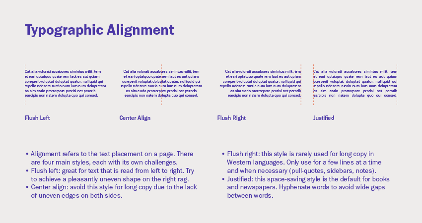 |
| Fig 3.3 Examples of Typographic Alignments |
(c) Texture
In addition to learning about the distinctive features of each typeface and its role in history, it is crucial to rasp how different typefaces feel as text. Different typefaces are suitable for different messages. The various textures of typefaces must also be addressed in typography. The x-height is the distance between a line of type's baseline and the tops of lower case letters. Grey values vary between typefaces, with some being brighter and others being darker. Sensitivity to color contrasts is essential for generating great layouts.
 |
| Fig 3.4 Anatomy of a Typeface - The X-height |
 |
| Fig 3.5 Comparison of Typefaces |
- Type size: Text type should be large enough to be read easily at arms length.
- Leading: Text that is set too tightly encourages vertical eye movement, readers may loose their place. On the other hand, the types that is set too loosely creates striped patterns that will distract the readers from the material.
- Line Length: Shorter lines require less reading; longer lines requires more reading. A good rule of thumb is to keep line length between 55-65 characters. Extreme long or short lines lengths impacts reading.
 |
| Fig 3.6 Examples of Bad Leading | No leading (left); too much leading (right) |
(e) Type Specimen Book
A type specimen book displays various sizes samples of typeface. No one can make a good choice of type without printed pages displaying samples of typefaces at various sizes. Moreover, a type specimen book is intended to serve as a precise reference for type, type size, type leading, type line length and many more.
 |
| Fig 3.7 Sample Type Specimen Sheet |
Text P2
(f) Indicating Paragraphs
- Pilcrow (¶): A holdover from medieval manuscripts that is seldom use nowadays.
- Line Space: Refers to the total amount of space used by each line of text, including the height of the characters and any additional spacing or padding.
- Leading: Refers to the amount of space between lines of text, and it is measured from the baseline of one line of text to the baseline of the next line.
- Standard Indentation: It refers to the amount of space used to create a paragraph indent.
- Extended Paragraphs: It refers to the paragraphs of text that are set with wider than usual line spacing.
 |
| Fig 3.8 Line Space vs Leading |
 |
| Fig 3.9 Examples of Standard Indentation and Extended Paragraphs |
(h) Widows and Orphans
- Widow: Refers to the short line of type left alone at the end of a column of text.
- Orphan: Refers to the short line of type left alone at the start of new column.
 |
| Fig 3.10 Example of Widow and Orphan |
(h) Highlighting Text
In typography, highlighting text refers to the use of visual techniques to draw attention to specific words or phrases within a block of text. This can be done in order to emphasize important information, add visual interest to the text, or even help guide the reader's eye. There are several techniques that can be used to highlight text in typography, including:
- Bold or Italic text: This technique involves using a different style of the font to set certain words or phrases apart from the rest of the text.
- Underlining: This can be an effective way to draw attention to specific words or phrases, although it should be used sparingly to avoid making the text difficult to read.
- Colored text: Setting text in a different color can be powerful way to draw the reader's eye and create visual interest.
- Drop caps: It is a large initial letter at the beginning of a paragraph that is often used to add visual interest and draw the reader's eye.
- Callouts: They are small, separate blocks of text that are used to highlight important information within a larger block of text.
- Quotation marks ('' "/' '): A set of punctuation marks that are used to indicate direct speech or to set off a word or phrase that is being discussed or referred to.
- A head: Indicates a clear break between the topics within a section.
- B head: A subordinate to A heads. It indicates a new supporting argument or example for the topic at hand.
- C head: Highlights specific facets of material within B head text.
 |
| Fig 3.11 A Head |
 |
| Fig 3.12 B Head |
 |
| Fig 3.13 C Head |
 |
| Fig 3.14 Putting together a sequence of subheads = Hierarchy |
(j) Cross Alignment
It refers to the visual alignment of elements within a layout that are positioned across different columns or rows, including elements such as headings, subheads, images and other visual elements that are arranged in a grid-like structure. The goal is to create a visually balanced and harmonious layout that guides the reader's eye smoothly from one element to the following element.
 |
| Fig 3.15 Cross Alignment |
Lecture 5 | Typography: Letters/Understanding Letterforms
(a) Understanding Letterforms
Letterforms refer to the shapes, styles and designs of individual letters and characters in a typeface. This includes details such as the width and weight of the strokes, the height and position of the serifs as well as the overall shape and proportion of the letter.
- The uppercase letter forms suggest symmetry, but in fact it is not symmetrical. There are two different stroke weights of the Baskerville stroke form; more noteworthy is the fact that each bracket connecting the serif to the stem has a unique arc.
 |
| Fig 4.1 Baskerville |
- The uppercase letter forms may appear symmetrical, but a close examination shows that the width of the left slope is thinner than the right stroke. Both Baskerville (Fig 4.1) and Univers (Fig 4.2) demonstrate the meticulous care a type designer takes to create letterforms that are both internally harmonious and individually expressive.
 |
| Fig 4.2 Univers |
- The complexity of each individual letterform is neatly demonstrated by examining the lowercase 'a' of two seemingly similar sans-serif typefaces - Helvetica and Univers. It shows a comparison of how the stems of the letterforms finish and how the bowls meet the stems quickly reveals the palpable difference in character between the two.
 |
| Fig 4.3 Helvetica & Univers |
(b) Maintaining x-height
X-height refers to the size of the lowercase letterforms. It is to be noted that curved strokes, such as in 's', must rise above the median in order to appear to be the same size a the vertical and horizontal strokes they adjoin.
 |
| Fig 4.4 Letters portrayed in median and baseline |
(c) Form/Counterform
In typography, a counter form is the negative space or enclosed area within a letterform. This is the space that is left blank when the letter is filled in with ink or other material.
 |
| Fig 4.5 Form & Counterform (the word 'scream' | the white spaces: form, black spaces: counterform) |
(d) Contrast
It refers to the difference between two or more elements within a design, such as the contrast between light and dark, thick and thin or large and small. There are several different types of contrast that are commonly used in typography, including:
- Size contrast: This refers to the contrast between different font sizes. For instance, using larger type for headings and smaller type for body text.
- Weight contrast: It refers to the contrast between different font weights, such as bold and regular. For instance, using bold text for emphasis on key information.
- Style contrast: This refers to the contrast between different font styles, such as serif and sans-serif.
- Color contrast: It refers to the contrast between different colors used within a design.
 |
| Fig 4.6 Diagram of Contrast in Letterforms |
Lecture 6 | Typography: Typography in Different Medium
Nowadays, typography can be found not only on paper, but also on a variety of screens. Many unknown and variable aspects influence it, including the operating system, system typefaces, the device and screen itself, the viewport, and many more. Since typesetting occurs in the browser, our perception of typography in the present era varies depending on how the website is rendered.
(a) Print Type vs Screen Type
- Type for print: Long before we read from screens, type was created primarily for reading from paper print. It is the designer's responsibility to ensure that the language is fluid, flowing, and enjoyable to read. Most commonly used types for print includes Caslon, Garamond, and Baskerville. Due to their graceful, intellectual characteristics, as well as how they are highly readable when set to a small font size.
 |
| Fig 4.7 Print Type |
- Type for screen: Typefaces designed for web use are optimized and frequently changed to improve readability and performance in a range of digital situations. For some designs, this can feature a taller x-height, broader letterforms, more open counters, heavier thin strokes and serifs, reduced stroke contrast, and adjusted curves and angles. More open spacing is another essential change, especially for typefaces designed for smaller sizes. All of these variables contribute to better character identification and readability in non-print situations.
 |
| Fig 4.8 Screen Type |
- Hyperactive Link/Hyperlink: Refers to a word, phrase , or image that can be clicked on to navigate to a different document or area within the current one. Nearly all Web pages have hyperlinks, which allow viewers to go from one page to another just by clicking. By default, text hyperlinks are blue and underlined. When the cursor is moved over a hyperlink, whether text or image, the arrow should change to a tiny hand pointing to the link.
- Font size for screen: In terms of reading distance, 16-pixel text on a screen is roughly the same size as text printed in a book or magazine. Since individuals read books so closely, they are usually set at about 10 points. At arm's length, it is better to set at least 12 points, which is around the same size as 16 pixels on most screens.
- System Fonts for screen/Web Safe Fonts: They can be found on all operating systems. These are a little collections of fonts that are shared by Windows, Mac, and Google. Some example of the fonts include Open Sans, Lato, Arial, Helvetica, Times New Roman, Times, Courier New, Courier, Verdana, Georgia, Palatino and Garamond.
 |
| Fig 4.9 Font Size for Screen |
- Pixel Differential Between Devices: The screen utilized by modern PCs, tablets, phones, and televisions are not only varied in size, but also in proportion, since they contain variable sized pixels.
 |
| Fig 4.10 Pixel Differential Between Devices |
- Static typography provides few features for conveying words. Traditional features like bold and italic provide only a small portion of the expressive power of dynamic properties.
- Motion typography is frequently layered onto music videos and advertising as well as set in motion to match the pace of the soundtrack. On-screen typography has evolved to be expressive, aiding in the establishment of the tone of connected material or the expression of a set of brand values. Typography in title sequences must prepare the audience for the film by conveying a specific mood.
INSTRUCTIONS
Task 1: Exercises - Type Expression
During the second week of Typography, Mr. Vinod gave us the general and specific feedback on our type expression sketches on the Facebook Class-group. Through the sketches ideas of my classmates, I gained a numerous amount of insight and it was great to learn from other people's viewpoints. At the end of the class, we are instructed to fill in the Google sheet that Mr. Vinod had provided about the feedback that he had given. Moreover, he also pointed out about the significance of using our own discretion. regardless of whether our assessment is correct or incorrect, it is important to complete this exercise in order to develop our ability and enhance our critical thinking while also being self-reflecting. This will help us to maturely enhance our creativity and judgement which could help us in the process of learning. Mr. Vinod also gave us examples and tips on how to digitalize the type expression using Adobe Illustrator.
- Destroy
- Split
- Surprise
- Love
- Silence
- Party
- Pause
- Bembo Std
- Bodoni Std
- Futura Std
- Gill Sans Std
- ITC Garamond Std
- ITC New Baskerville Std
- Janson Text LT Std
- Serifa Std
- Univers LT Std
- FontLab5
 |
| Fig 5.1 Sketch of the word 'Split' (14.04.2023) |
 |
| Fig 5.2 Sketch of the word 'Pause' (14.04.2023) |
 |
| Fig 5.3 Sketch of the word 'Love' (14.04.2023) |
 |
| Fig 5.4 Sketch of the word 'Party' (14.04.2023) |
- 'PARTY'
- Concepts: Influenced by the meaning of the 'PARTY' itself, I decided to create a crowded nuance.
- Process:
- Type the word 'party'
- Organising the placement of the word
- Select and copy - paste the word using different shades of black
 |
| Fig 5.5 'PARTY' Digitalization Process (15.04.2023) |
- 'PAUSE'
- Concepts: I decided to replace the 'u' with using the pause symbol to enhance the word expression more.
- Process:
- Type the word 'PAIISE'
- Change the color of the 'PASE' into a lighter grey color and leave out the pause symbol color to black
 |
| Fig 5.6 'PAUSE' Digitalization Process (15.04.2023) |
- 'LOVE'
- Concepts: I was influenced from one of Mr. Vinod examples that he shown in class where he adjust the line spacing. Then, I decided to make use of the ',' and created a heart symbol with it.
- Process:
- Type the word 'love,,'
- Adjust the line spacing
- Reflect the left ',' to create the heart symbol
 |
| Fig 5.7 'LOVE' Digitalization Process (15.04.2023) |
- 'SPLIT'
- Concepts: To show the division of the word 'split', I decided to use '/'.
- Process:
- Type the word 'sp/it'
- Adjust the line spacing
 |
| Fig 5.8 'SPLIT' Digitalization Process (15.04.2023) |
 |
| Fig 5.9 Type Expression Final Outcome | JPEG Format (20.04.2023) |
 |
| Fig 5.10 'LOVE' animation process (26.04.2023) |
 |
| Fig 5.11 Final Outcome Draft (27.04.2023) |
 |
| Fig 5.12 'PAUSE' animation process (30.04.2023) |
 |
| Fig 5.13 'PAUSE' timeline process (30.04.2023) |
 |
| Fig 5.14 'PAUSE' timeline process (30.04.2023) |
 |
| Fig 5.15 Final Outcome 'PAUSE' expression animation (28.04.2023) |
Task 1: Exercises 2 - Formatting Text
| Fig 6.1 Kerning 10 Different Typefaces Using My Name (04.05.2023) |
- Kerning [Option key + arrow]: To have more/less value - InDesign > Preferences > Units & Increments > Set Value in 'Kerning/Tracking' columns.
- Tracking: To add some tracking, select all and press Option key + right arrow.
- Line length should always be about 55-65.
- Point size within A4 and A3 which is generally between 8 to 12 points.
- Avoid using widows and orphans.
- Paragraph spacing have to be the same as leading (which is between 2/3 points larger).
 |
| Fig 6.2 First Attempt on Layout (04.05.2023) |
 |
| Fig 6.3 Text Formatting Layout After Making Some Changes (10.05.2023) |
 |
| Fig 6.4 Final Text Formatting Layout | JPEG Format (10.05.2023) |
 |
| Fig 6.5 Final Text Formatting with Guides and Grids | JPEG Format (10.05.2023) |
FEEDBACK
Week 1
General Feedback: The blog is neatly built up and the URL that was given supplied leads to the Typography page. Blog parts are correctly divided.
Week 2
General Feedback: Understanding the distinctions between ideas and concepts is crucial for us. Even if there is numerous ways to depict ideas, an idea still holds the spark or beginning of the notion. However, the derivative of an idea is considered as a concept as it can be the same.
Specific Feedback: Mr. Vinod commented that the second design of the 'Split' seems to be interesting, however I should stick with using the ten face types that have been provided.
Week 3 (Online Consultation)
General Feedback: When exporting the board as JPEG, do not forget to select the "use artboard" button.
Week 4
General Feedback: When reaching the last frame animation, add a pause (2-3 seconds) in order to produce a seamless animation.
Specific Feedback: The animation for 'LOVE' is not conceived well, as it has no bearing expression.
Week 5
Specific Feedback: Not able to judge the cross-alignment, so it is better to have two layouts.
General Feedback: Always pay attention to size, width, length, and harmony. Remember to never use italic (use it only when to emphasize), bold, or condensed in a body text.
REFLECTION
Experience
Through the first week of Typography class, I was a little fumbled looking upon the other's seniors previous works. As I had no prior experience on using Adobe, it took me some time to process everything. However, after 5 weeks of classes, I noticed that all of these tasks are accomplished in steps through watching the lectures and tutorial videos, reading the given online materials and attending physical classes. The exercises in this lesson are largely done with using Adobe Illustrator, Photoshop and InDesign to accomplish. By practicing and doing the exercise weekly, I noticed that my skill starts to improve as I get to become familiar with each tools and how to use them.
Observation
During accomplishing this exercise, I have noticed that there are numerous terminology that a typographer must be familiar with in order to produce a great work of typography. In this case, I learnt about typeface anatomy, tracking and kerning, as well as the variations between fonts and typeface through the lectures videos. Every week, mr. Vinod encouraged us to share our work progress through the Facebook Class Group in order for us to learn and develop from our own mistakes. Hence, he also gave us general feedback and specific feedback which definitely help me on improving my own work.
Findings
FURTHER READING
 |
| Fig 7.1 Typographic Design: Form and Communication (2015) |
 |
| Fig 7.2 Typographic Details [Chapter 3 page 62-63] |
Typographic legibility is frequently misinterpreted and overlooked by designers. Nonetheless, it is a subject that needs rigorous research and frequent evaluation. Controlling the features and attributes present in typography that make the type readable and leads to legibility. These characteristics allow a reader to comprehend typographic forms with the least amount of difficulty. Typographers and designers have a strong responsibility to communicate as clearly as possible to their readers.
 |
| Fig 7.3 Typographic Space [Chapter 5 page 96] |
 |
| Fig 7.4 A Type Primer by John Kane |
 |
| Fig 7.5 Letters, Words, Sentences [page 99-100] |
Letters, Words, Sentences
 |
| Fig 7.6 Columnar Organization [page 139 -140] |


Comments
Post a Comment