Design Priniciples - Project 1
14.10.2022 - 28.10.2022 (Week 5 - Week 7)
Sorcha Griselda / 0353056
Design Principles / Bachelor of Design in Creative Media / Taylor's University
Project 1: Self-Portrait
INSTRUCTION
1 | Recap of Project 1
Starting from Week 5-7, we are assigned to create a portrait of ourselves by applying the various principles that we had learnt through the past weeks. Hence, in order to produce a portrait of ourselves, we should first gather visual references and choose the images that are suitable for the upcoming self-portrait design.
What is Self-Portrait?
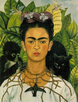
A self-portrait is a portrait of the artist that has been painted by the artist themselves. Self-portraits have been created in every conceivable medium, such as:
- Paintings
- Sketches

Figure 1.2 Self-portrait by David Hockney, 1982 (www.mutualart.com)
- Sculptures
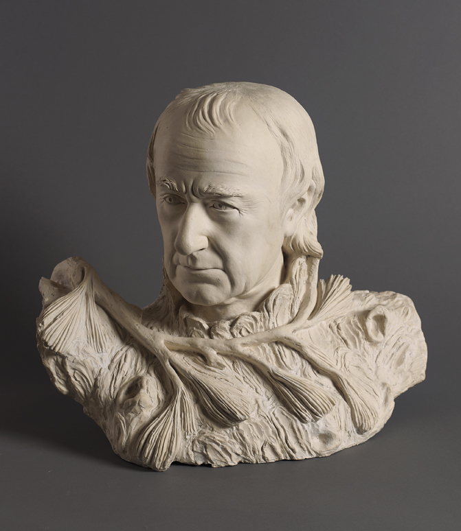
Figure 1.3 Terracotta sculpture by William Rush, 1822 (www.pafa.org)
- Photographs

Figure 1.4 Self-portrait talking to Vince by Francesca Woodman, 1977 (www.photographycourse.net)
Before starting on creating the self-portrait, I have asked myself several questions:
- What are the memories that I want to portray?
- How are my feelings and thoughts?
- What do other people see me based on my personality?
2 | Design Process
After conducting some visual research, I decided to create a self-portrait based on my personal experiences of my high school life and upbringing.
Visual References

|
|
Figure 2.1 Visual References |

|
||
Figure 2.2 Two Colored Marilyn by Andy Warhol (Reversal), 1979
|

- What are the memories that I want to portray?
- friendship, school things, comfort food
- How are my feelings and thoughts?
- mixed emotions of happiness and sad
- What do other people see me based on my personality?
- a calm and cheerful person

|
|
Figure 2.4 Drawing Process of the Tears |

|
|
Figure 2.5 First attempt |

|
| Figure 2.6 Process on the Background Texture |

|
|
Figure 2.7 Process of the Doodle Sketches |

|
| Figure 2.8 Blue Cries |
FEEDBACK
- Great idea. Ms. Noranis told me to add collages of the things that reminds me about home and school.
- Resize the photo, make it slightly smaller in order to create more space for the drawing
- Ms. Noranis advised me to use the same technique as the tears flow for the doodling.
- Add more texture in the background, use the watercolor effect.
REFLECTION
Throughout this project, I have learnt many new things about self-portrait and myself. I discovered that self-portraiture can unlock our imagination and create new fresh ideas on the things that we want to portray about ourselves. Actually, it is a skill that can inspire us while also connecting us to others and serving as a reminder of our roots. Overall, this assignment gave me a wonderful opportunity to learn about myself and discover new things.


Comments
Post a Comment