Packaging and Merchandising Design: Exercises
25.04.2024 - 16.06.2024 (Week 1 - Week 4)
Sorcha Griselda / 0353056
Packaging and Merchandising Design / Bachelor of Design in Creative Media / Taylor's University
Task 1 | Exercises
LECTURE
Week 1 | Module Information
Mr. Shamsul provided us with a summary of the tasks and projects that we can
anticipate in this module.
Week 2 | What is packaging?
Introduction to Packaging - Design
- Packaging is referred to the container or wrapping that protects and hold the product.
- Identify target audience, brand identity, and practical considerations such as ease of use and sustainability.
- Through creating an effective package design, brands can connect with consumers on emotional level.
The Evolution of Packaging
- 5000 BCE: The earliest known packaging was made from natural materials such as leaves, reeds, and bark, which were used to store and transport food and other goods.
- 2600 BCE: The ancient Egyptians developed paper-like material made from the papyrus plant, which they used for packaging.
- 1500 BCE: The ancient Greeks and Romans used clay pots, amphorae, and jars to store and transport liquids such as wine and olive oil.
- 1850: The first paperboard box was produced in England, paving the way for modern cardboard packaging.
- 1890s: Cellophane, a transparent and moisture-resistant film made from cellulose, was invented and became popular for wrapping food and other products.
- 1900s: The first metal cans were introduced, providing a new way to preserve and transport food.
- 1930s: The first plastic packaging, made from synthetic materials such as polyethylene and polyvinyl chloride (PVC), was introduced.
- 1950s: The first aerosol cans were introduced, revolutionizing the packaging of personal care and household products.
- 1970s: The focus on sustainability and environmental concerns led to the development of recyclable and biodegradable packaging materials.
- 2000s: The rise of e-commerce and online shopping has led to the development of new packaging technologies such as bubble wrap, air pillows, and other protective materials designed to protect products during shipping.
Packaging Design
- Product positioning is a strategic activity explaining where and how your product or service fits in the current marketplace and why it's better than other alternatives.
- The design of a packaging involves creating a visual and sensory experience that resonates with the consumer and communicates the product's value.
- Designing a package involves more than just choosing the right shape, color, font, and material. These components work together to create a unified and visually appealing package that stands out on the shelves and catches the consumer's attention.
- The functionality of the package, including its cost-effectiveness, sustainability, and ease of use, must also be taken into account in successful packaging design.
- To build a package that is both useful and aesthetically pleasing, it must strike a balance between the two requirements.
- Physical Protection:
- Packaging must be designed to keep the product safe from damage during transport, storage, and handling.
- Identification:
- Packaging is frequently used to make products easier and faster for customers to recognize. The product name, logo, and other crucial information that enables consumers to quickly identify the product on shop shelves or online are all included in effective packaging design.
- To Transport:
- To easily and safely move the product from the manufacturer to the consumer.
- Differentiation:
- Effective packaging design should be distinctive and memorable, with unique color schemes, typography, and imagery that helps the product to stand out on crowded shelves.
- Communication:
- Effective packaging design should include clear and concise messaging that helps customers understand what the product is and how it can be used.
- Marketing:
- Effective packaging design should align with the brand's overall marketing strategy and messaging, creating a cohesive brand identity that resonates with customers.
Information on Packaging
- Product name: The name of the product must be clearly displayed on the packaging so that customers can easily identify what they are purchasing.
- Net quantity: The amount or weight of the product contained in the packaging must be indicated, usually in both metric and imperial units.
- Ingredients: If the product contains any allergens or other ingredients that may cause harm to consumers, these must be listed on the packaging.
- Nutritional information: For food products, nutritional information such as the calorie count, fat content, and sugar content must be included.
- Country of origin: The country where the product was made must be stated on the packaging.
- Manufacturer information: The name and contact information of the manufacturer or distributor of the product must be included.
- Warning labels: Certain products may require warning labels to inform customers about potential hazards or risks associated with the product.
- Packaging is an artistic medium that allows for expression. Physical and visual components collaborate to convey emotional, cultural, social, psychological, and informational clues to the target consumer in order to create a product's expression that appeals to a certain consumer market.
Week 3 | Understanding Board Tools & Techniques
- Packaging design necessitates not only a new set of hand skills for the packaging designer, ranging from innovative engineering to mastery of mock-up creation, but also a new way of thinking about a problem and presenting information.
The tools that package designer should have:
- Metal ruler
- Scorring tool
- Cutting mat
- T-square
- Adhesive (spray mount, PVA glue, double sided)
- Scissors

|
| Fig 1.1 Scoring |
The structure of packaging:
- The six-sided box: The most popular polyhedron utilized in storage systems is the six-sided box. It is easy to assemble and convenient to stack, move, and exhibit.
- The pyramid: The pyramid is a polyhedron that is more intricate. A pyramid can have three sides or more, and the base will vary depending on the configuration.
-
The cone: Similar to a pyramid, a cone has a spherical base with a single triangular side that wraps around upon itself along the base, as opposed to a pyramid's three, four, or five sided base. The cone has unique engineering challenges in packaging and is a rare form in package design.
- The cylinder: There is only one vertical side to the cylinder, and it curves around upon itself. Typically, moldable materials like plastic or metal are used to create cylinder shapes rather than paperboard.
Studio Techniques:
- Die Cutting: create windows on the packaging
- Embossing: where some surface pops up a bit on the packaging (looks like a tactile)
- Perforations: the process of cutting or punching a pattern of tiny holes or slits into a sheet of paper, cardboard, plastic, or film used for packing purposes.
- Pop-ups
- Uv varnish: it is a clear or translucent liquid that dries quickly and leaves a hard, shiny finish
Week 4 | Boxes Type and Boxes Styles
Common Type of Boxes
- Folding Cartons: paperboard cartons, or paperboard boxes
- Eg: Cereal box
- Rigid boxes (set-up boxes): are sturdier and do not fold or collapse as folding cartons do. They are not always used for higher end products where perceived value is important. In addition, they are also used when the product within is heavy and in need of extra support.
- Corrugated boxes (brown cardboard boxes): Also called corrugated board, corrugated fibre board or combined board. It typically has three layers and has a wavy or fluted layer sandwiched between two outer flat layers. Mostly used to ship a company’s retail-ready.
Common Elements in Folded Cartons
- Reverse Tuck End (RTE): The top closure tucks from the rear to the front, and the bottom closure tucks from the front to the rear.
- Pros: Cost effective because you can run more boxes at one time on the same sized paperboard as opposed to the STE.
- Cons: Not good for heavy products and not as aesthetically pleasing because of the visible raw edges in the front of the box.
- Industries that most commonly use RTE: Cosmetics, Health and Beauty, Pharmaceutical
- Straight Tuck End (STE): Both the top and bottom closures tuck from the front to the rear.
- Pros: More luxurious than RTE because there are no white raw edges visible on the front of the box and avoids any blockade between the tuck flap and any front window film (see-through window to display the product.
- Cons: More expensive, manufacturers less boxes at one time per paperboard sheet and not good for heavy products.
- Industries that most commonly use STE: Cosmetics, Health and Beauty
- Tuck Top Snap Lock Bottom: This box, also known as a “1-2-3 bottom”, has a bottom closure that closes in 3 simple steps.
- Pros: Works well for heavier products (bottom closure can handle more weight)and relatively quick loading (the 3 steps are easy).
- Cons: More expensive than a bottom tuck box and takes slightly more time to “set-up”.
- Industries that most commonly use TTSLB: Toys, Food, Health and Beauty
- Tuck Top Auto Bottom: This box has a bottom closure that makes setting up the box a breeze.
- Pros: Works well for heavier products (bottom closure can handle more weight) and ultra fast assembly.
- Cons: More expensive than a bottom tuck or snap-lock bottom (factory has to perform an extra step by gluing the bottom).
- Industries that most commonly use TTAB: Toys, Health and Beauty, Cosmetics
- Closures Types for the Tuck Top Box Styles: All of these Tuck Top boxes can include “Slit-Lock” or “Friction Fit” lock features for extra snug hold and to prevent the top from bowing.
INSTRUCTION
Exercise 01
For this exercise, we need to choose four products in the market that
we believe have poor packaging design. We also need to ensure the product is
readily available for purchase as we are going to need bring the product to
class.
Poor Packaging: Sunlight | Plastic
1. Overview

|
| Fig 1.1 Sunlight's Packaging |
Sunlight is a well-known household cleaning brand, particularly for its
dishwashing products. With a history spanning more than a century, it has
made a name for itself as a reliable brand that is associated with
efficiency and cleanliness. As a pioneer in the dish soap market, Sunlight
has consistently delivered innovative formulas and packaging designs that
cater to the evolving needs of consumers. Its products are designed to
tackle tough grease and grime while being gentle on hands and the
environment. Sunlight's brand identity is centered on its dedication to
cost, convenience, and quality. The company knows how important it is to
have a hygienic and clean kitchen, so they make solutions that make
dishwashing easier and leave dishes looking spotless and smelling great.
2. Product Analysis

|
| Fig 1.2 Sunlight's poorly designed lids |
Sunlight dish soap is often packed in plastic bottles or containers.
Plastic is used because it is easy to use, inexpensive, and durable. Its
vivid and bold colors, which frequently include tones of blue and
yellow, distinguish Sunlight's packaging design. Such colors evoke a
sensation of efficiency, freshness, and cleanliness. Ergonomic bottle
designs usually have simple dispensers or lids that make it easy to pour
or squeeze the product.
- Practicality: Sunlight's packaging often meets consumer expectations for practicality by using plastic bottles with easily accessible dispensers or caps. However, in this case, Sunlight's packaging may have functional flaws, such as poorly designed dispensers or lids that cause spillage or make it difficult to pour the product. Customers may become frustrated and dissatisfied if they find it difficult to use the packaging efficiently.
- Visual appeal: Sunlight’s packaging often incorporates vibrant colors and legible labeling that clearly show the brand name and important product details. This is because customers expect products to be visible and simple to identify, and this meets their expectations.
- Font: Sunlight's packaging typically features a clean, sans-serif typeface for the brand name and product information. Although the typeface is readable, certain customers could find it difficult to read the brand name because it is much smaller than the graphic elements.
- Sustainability: Although Sunlight has made an attempt to use recyclable materials in its packaging, there are still ways to improve its eco-friendly features even more, such as by looking into refillable choices.
3. Market Research

|
| Fig 1.3 Dish soaps Aisle |
For the most part, Sunlight's present packaging meets the needs and
preferences of its intended market, which are families, young
professionals, and individuals who prioritize convenience and
effectiveness in their cleaning products. Besides providing useful and
user-friendly features, it effectively conveys the product's prominent
traits, such as cleanliness and freshness. To better suit the tastes of
environmentally conscious customers, there might be possibilities to
improve sustainability features even more. Further investigation and
customer input will be helpful in improving the packaging design to better
meet the demands of Sunlight's intended audience.
4. Competitor Analysis

|
| Fig 1.4 DAWN's Packaging |
- Strengths: Dawn is renowned for its potent grease-cutting recipe and ability to tackle even the most difficult cleaning jobs. The company sells a large selection of dish soaps with concentrated, gentle on hands, and antibacterial properties to meet a variety of needs.
- Weaknesses: Dawn's products are more expensive than those of some of its rivals, which may reduce the appeal of the brand to customers who are budget conscious.
- Opportunities: Sunlight can set itself apart by providing more reasonably priced solutions without sacrificing quality. Furthermore, focusing on particular consumer groups, like those who are allergic to certain foods or who are environmentally conscious, may have growth prospects.
- Risks: Dawn's loyal customers and solid brand recognition put Sunlight's market share in jeopardy. To properly compete, Sunlight needs to innovate and effectively explain its unique value proposition.
Poor Packaging: ORIENTAL (Green Pea Snack) | Aluminum Laminated
with Polypropylene
1. Overview

|
| Fig 1.5 ORIENTAL's Packaging |
The Oriental Snack brand is a well-known name in the snack food business,
offering a varied selection of goods to satisfy consumers' appetites for
great and distinctive flavors. Established with the aim to supply premium
snacks influenced by Asian cuisine, the company has gained a standing for
creativity, authenticity, and superior flavor. The collection of Oriental
includes a broad range of snacks, such as crispy coated almonds, savory
crackers, and crunchy chips. Premium ingredients and genuine recipes are
used to manufacture each product, giving customers an authentic taste
experience that will transport them to the bright flavors of Asia.
2. Product Analysis
- Practicability: Functional problems with the packaging, such as insufficient sealing or closure mechanisms, could cause the product to spoil or lose its freshness. Customers may become frustrated and develop a poor impression of the brand if they have trouble opening or resealing the packaging.
- Visual appeal: The package itself just features a single image of a pea in the right corner, demonstrating the lack of visually striking design elements. Lower sales could arise from an uninspiring design that doesn't stand out among rivals. Customers may find it difficult to emotionally connect with the product when the packaging fails to communicate the brand identity, which could affect brand loyalty.
- Font: The use of inconsistent typefaces on the package gives the product a disorganized look. Variations in typeface style, size, or spacing can take away from the design's overall coherence and give a poor design impression.
- Sustainability: The lack of sustainability measures packaging may tarnish the image of the product among consumers who care about the environment. Customers want companies to give eco-friendly packaging solutions top priority as they become more conscious of environmental issues and plastic waste. Excessive packaging or non-recyclable materials can also cause waste and harm the environment, prompting criticism from consumers and environmental activists.
3. Market Research

|
| Fig 1.6 Snacks Aisle |
The target market for Oriental Snack is likely to comprise people of all
ages, particularly those who enjoy snacking and enjoy Asian-inspired
flavors. Although the brand might appeal to a wide spectrum of
consumers, its distinctive flavors and daring snack selections might
draw in younger consumers, such as millennials and Gen Z. Several
distribution channels, such as supermarkets, convenience stores and
online merchants, allow for Green Pea Snack to be broadly accessible.
Oriental may target its core audience and broaden its market reach by
employing social media marketing, advertising campaigns, and strategic
partnerships to increase exposure and boost sales of the Green Pea
Snack.
4. Competitor Analysis

|
| Fig 1.7 Calbee's Packaging |
- Strengths: Calbee is a well-known Japanese snack brand offering a variety of chips, crackers, and other snacks. It has a strong focus on quality and authenticity.
- Weaknesses: Calbee may have limited availability outside of Asian markets, providing an opportunity for Oriental Snack to expand its market reach. Moreover, Calbee’s products are much more expensive compared to Oriental.
- Opportunities: Oriental Snack can differentiate itself by offering a broader range of Asian-inspired flavors and products, appealing to consumers seeking authentic Asian snacks.
- Risks: Calbee's strong brand recognition and reputation for quality pose a threat to Oriental Snack's market share, particularly in Asian markets. Oriental Snack must differentiate its offerings and effectively communicate its unique value proposition to compete with Calbee.
Poor Packaging: Fitbar | Carton Box
1. Overview

|
| Fig 1.8 Fitbar's Packaging |
Fitbar is a product of KALBE, a reputable business in the wellness
and health industry. It is designed to provide a convenient
and tasty way to maintain a healthy diet, whether for a quick snack
at work, a post-workout energy boost, or a nutritious addition to a
child's lunchbox. Basically, it is promoted as a nutritional
substitute for typical snack bars and as a healthy snack option. The
products are intended for those that value balanced nutrition and
healthy ingredients.
2. Product Analysis
- Color scheme: Fitbar packaging uses a predominantly green color scheme to emphasize its health benefits. However, this color choice can be perceived as bland and does not stand out on shelves compared to the vibrant packaging of competitors.
- Visual appeal: The graphics on the packaging are minimalistic and often lack dynamic elements that attract attention. The images of ingredients and the product itself are not always appealing or appetizing.
- Font: The brand name “Fitbar” is prominently displayed in a bold, simple font, making it easily recognizable. Additional text, such as flavor descriptions and nutritional benefits, is usually presented in a straightforward manner, though it could benefit from more dynamic font choices to enhance visual interest.
- Sustainability:
- Fitbar packaging typically uses conventional materials such as cardboard box and plastic as wrappers. Although these materials are not ecologically friendly, they were selected because they are durable and cost-effective. The use of plastic is increasing waste and contamination in the environment. There are serious environmental dangers associated with plastic packaging since it is frequently not biodegradable and can take hundreds of years to break down.
3. Market Research
Fitbar targets consumers who are health conscious and looking for
quick and wholesome snack options by positioning itself as a
healthier substitute for conventional snack bars and sweet
products. Its target market consists of people with active lives,
working professionals, students, and individuals searching for a
guilt-free treat that fulfills cravings without compromising
health. The product is readily accessible via a number of
distribution channels, such as KALBE's own retail locations,
supermarkets, convenience stores, and online merchants. To
effectively reach its target group, Fitbar can be marketed through
sampling events, fitness facility partnerships, and advertising
campaigns.
4. Competitor Analysis

|
| Fig 1.9 RXBAR's Packaging |
- Strengths: RXBARs are well-known for their transparent packaging and minimal ingredient list, which appeals to customers looking for clean-label goods. The company places a strong emphasis on using simple, whole-food items like dates, almonds, and egg whites.
- Weaknesses: RXBARs could be more expensive than Fitbar, which might make them less affordable for customers on a tight budget.
- Opportunities: Fitbar may set itself apart by providing a less expensive substitute for RXBARs that nevertheless has comparable convenience and nutritional advantages.
- Risks: Fitbar's market share may be in danger because of RXBAR's strong brand positioning and devoted client base. Fitbar is in competition with RXBAR in the health and wellness snack market, and it needs to effectively communicate its unique selling propositions.
Poor Packaging: F&N Soda Water | Metal Can
1. Overview

|
| Fig 1.10 F&N's Packaging |
F&N (Fraser and Neave) is a well-established brand with a
long history in the beverage industry, particularly in
Southeast Asia. Known for its diverse range of products,
F&N offers various soft drinks, including its soda water,
which is a staple in many households and foodservice
establishments. F&N Soda Water is a carbonated beverage
that is often used as a mixer in cocktails, as a refreshing
drink on its own, or as an ingredient in various culinary
applications. It is a clear, sparkling beverage with a clean
and crisp taste, designed to complement other flavors without
overpowering them.
2. Product Analysis
- Color scheme: Compared to competitors' more colorful and eye-catching designs, the present F&N soda water cans' minimalistic style with a black background, which can be seen as dull and uninspiring compared to more vibrant and attractive designs from competitors.
- Visual appeal: The graphics on F&N soda water cans are frequently simple or mundane, lacking in visual intrigue or a clear brand message. When compared with rivals who employ captivating visuals or theme designs, F&N’s approach seems to be outdated and unappealing.
- Font: The F&N Soda Water can typically uses a bold, sans-serif font for the brand name and product description. The use of uppercase letters reinforces the brand's presence and makes it easily recognizable. This choice ensures clarity and readability from a distance, which is crucial for standing out on crowded shelves. The product information, such as "Soda Water," is usually in a slightly smaller, yet still bold font, ensuring it is readable but secondary to the brand name.
- Sustainability: F&N soda water cans are typically made from aluminum, which is one of the more sustainable packaging materials available due to its high recyclability. While aluminum is highly recyclable, the production process is energy-intensive and has a significant environmental footprint. The key to sustainability lies in ensuring that the cans are recycled.
3. Market Research
F&N’s soda water packaging lacks the visual impact seen in
competitors’ designs. The current tendency towards visually striking
and eye-catching content to draw in younger customers is not in line
with the conservative and minimalist approach. Competitors are
leveraging engaging graphics and thematic designs, which F&N’s
current packaging fails to do. This results in a missed opportunity
to capture consumer interest and stand out on shelves. F&N’s
packaging also does not fully address ergonomic concerns, making it
less convenient for consumers to use compared to competitor products
that focus on ease of handling and transport. With the growing
demand for eco-friendly packaging, F&N’s current designs might
lag behind competitors like Coca-Cola and Pepsi, who are actively
promoting their sustainable packaging initiatives. This might drive
away environmentally conscious consumers.
4. Competitor Analysis
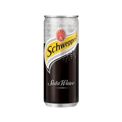
|
| Fig 1.11 Schweppes' Pacakging |
- Strengths: F&N is a well-known brand in Southeast Asia, with a strong market presence and loyal customer base. Typically positioned as a more affordable option compared to premium brands, making it accessible to a wider audience. On the other hand Schweppes is a globally recognized brand with a long history and strong market presence in many countries. It is perceived as a premium brand with high-quality products, often associated with superior taste and quality.
- Weaknesses: F&N is often viewed as a budget-friendly option, which may not appeal to consumers looking for premium products. Its packaging design is straightforward but lacks the premium feel that some consumers might prefer. On the other hand, Schweppes positioned as a premium product, which can be a barrier for price-sensitive consumers.
- Opportunities: F&N can start to expand into new markets within and outside of Southeast Asia. It also can introduces a premium line of soda water with enhanced packaging and flavor profiles could attract higher-end consumers. The brand should increase the use of recycled materials and promoting eco-friendly practices can enhance brand image.
- Risks: F&N's market share might be at risk due to Schweppes' strong brand and loyal customers. Competing with Schweppes, F&N needs to clearly highlight what makes its products special to stand out in the beverage market.
Exercise 02
For this exercise, we were instructed to create a packaging for the item that has been provided by Mr. Shamsul. For this, he said that we were also free to look at existing work online to create the best die-line possible.
 |
| Fig 2.1 The Item |
 |
| Fig 2.2 Sketches |
 |
| Fig 2.3 First Failed Prototype Attempt |
Initially, I sketched my dieline without much preparation or calculation because I was still confused with the shapes of my design. Unsurprisingly, it did not turn out well and was a complete failure. Determined to improve, I revisited the my sketches and put more thought into creating a new dieline. After refining my approach and paying closer attention to the details, I finally managed to design a functional packaging for the item. This process taught me the importance of careful planning and precision in packaging design, and I am proud of the progress I made from my initial attempt to the final product.
 |
| Fig 2.4 Second Attempt |
 |
| Fig 2.5 Final Prototype (Top View) |
 |
| Fig 2.6 Final Prototype (Side View) |
FEEDBACK
Specific: Great packaging analysis. Make
sure to choose different materials of product to analyze.
REFLECTION
Experience
Participating in the exercises provided an eye-opening experience in
understanding the fundamentals of packaging. Prior to this, I had limited
knowledge about the intricacies involved in creating packaging. Since it
was my first time making a box, I found the box-making exercise to be
really insightful. Working on mockups has also allowed me to grasp
concepts more easily and provided a hands-on learning experience. However,
I must admit, it required more effort than I anticipated.
Observation
The exercises have heightened my awareness of packaging designs in my
surroundings. I realized that not all boxes are created equal; each
possesses unique features that enhance functionality and aesthetics.
Additionally, I gained valuable insights into the process of constructing
boxes, a skill I had never previously considered.
Findings
One major surprise was the importance of mathematics in design. As someone
who has previously had difficulty with maths and measurements, the
box-making activity forced me to increase my accuracy and self-assurance
in these areas. It was difficult, but it proved how crucial it is to
practice this ability. In addition, analyzing different types of packaging
offered insightful information about the different limitations and factors
that go into design.
Comments
Post a Comment