Packaging and Merchandising Design: Final Compilation & Reflection
25.04.2024 - 01.08.2024 (Week 1 - Week 15)
Sorcha Griselda / 0353056
Packaging and Merchandising Design / Bachelor of Design in Creative Media / Taylor's University
Final Compilation & Reflection
INSTRUCTIONS
Final Project: Merchandise and Promotional Strategy
Final Project: Merchandise and Promotional Strategy | Week 10 - Week 15 (06.06.2024 - 01.08.2024)
FINAL SUBMISSIONS
Task 1: Exercises | Week 1 - Week 4 (25.04.2024 - 16.06.2024)
Exercise 01 | Poor Packaging Design
Sunlight | Plastic
1. Overview
 |
| Fig 1.1 Sunlight's Packaging |
Sunlight is a well-known household cleaning brand, particularly for its dishwashing products. With a history spanning more than a century, it has made a name for itself as a reliable brand that is associated with efficiency and cleanliness. As a pioneer in the dish soap market, Sunlight has consistently delivered innovative formulas and packaging designs that cater to the evolving needs of consumers. Its products are designed to tackle tough grease and grime while being gentle on hands and the environment. Sunlight's brand identity is centered on its dedication to cost, convenience, and quality. The company knows how important it is to have a hygienic and clean kitchen, so they make solutions that make dishwashing easier and leave dishes looking spotless and smelling great.
2. Product Analysis
 |
| Fig 1.2 Sunlight's poorly designed lids |
Sunlight dish soap is often packed in plastic bottles or containers. Plastic is used because it is easy to use, inexpensive, and durable. Its vivid and bold colors, which frequently include tones of blue and yellow, distinguish Sunlight's packaging design. Such colors evoke a sensation of efficiency, freshness, and cleanliness. Ergonomic bottle designs usually have simple dispensers or lids that make it easy to pour or squeeze the product.
- Practicality: Sunlight's packaging often meets consumer expectations for practicality by using plastic bottles with easily accessible dispensers or caps. However, in this case, Sunlight's packaging may have functional flaws, such as poorly designed dispensers or lids that cause spillage or make it difficult to pour the product. Customers may become frustrated and dissatisfied if they find it difficult to use the packaging efficiently.
- Visual appeal: Sunlight’s packaging often incorporates vibrant colors and legible labeling that clearly show the brand name and important product details. This is because customers expect products to be visible and simple to identify, and this meets their expectations.
- Font: Sunlight's packaging typically features a clean, sans-serif typeface for the brand name and product information. Although the typeface is readable, certain customers could find it difficult to read the brand name because it is much smaller than the graphic elements.
- Sustainability: Although Sunlight has made an attempt to use recyclable materials in its packaging, there are still ways to improve its eco-friendly features even more, such as by looking into refillable choices.
3. Market Research
 |
| Fig 1.3 Dish soaps Aisle |
For the most part, Sunlight's present packaging meets the needs and preferences of its intended market, which are families, young professionals, and individuals who prioritize convenience and effectiveness in their cleaning products. Besides providing useful and user-friendly features, it effectively conveys the product's prominent traits, such as cleanliness and freshness. To better suit the tastes of environmentally conscious customers, there might be possibilities to improve sustainability features even more. Further investigation and customer input will be helpful in improving the packaging design to better meet the demands of Sunlight's intended audience.
4. Competitor Analysis
 |
| Fig 1.4 DAWN's Packaging |
- Strengths: Dawn is renowned for its potent grease-cutting recipe and ability to tackle even the most difficult cleaning jobs. The company sells a large selection of dish soaps with concentrated, gentle on hands, and antibacterial properties to meet a variety of needs.
- Weaknesses: Dawn's products are more expensive than those of some of its rivals, which may reduce the appeal of the brand to customers who are budget conscious.
- Opportunities: Sunlight can set itself apart by providing more reasonably priced solutions without sacrificing quality. Furthermore, focusing on particular consumer groups, like those who are allergic to certain foods or who are environmentally conscious, may have growth prospects.
- Risks: Dawn's loyal customers and solid brand recognition put Sunlight's market share in jeopardy. To properly compete, Sunlight needs to innovate and effectively explain its unique value proposition.
ORIENTAL (Green Pea Snack) | Aluminum Laminated with Polypropylene
1. Overview
 |
| Fig 1.5 ORIENTAL's Packaging |
The Oriental Snack brand is a well-known name in the snack food business, offering a varied selection of goods to satisfy consumers' appetites for great and distinctive flavors. Established with the aim to supply premium snacks influenced by Asian cuisine, the company has gained a standing for creativity, authenticity, and superior flavor. The collection of Oriental includes a broad range of snacks, such as crispy coated almonds, savory crackers, and crunchy chips. Premium ingredients and genuine recipes are used to manufacture each product, giving customers an authentic taste experience that will transport them to the bright flavors of Asia.
2. Product Analysis
- Practicability: Functional problems with the packaging, such as insufficient sealing or closure mechanisms, could cause the product to spoil or lose its freshness. Customers may become frustrated and develop a poor impression of the brand if they have trouble opening or resealing the packaging.
- Visual appeal: The package itself just features a single image of a pea in the right corner, demonstrating the lack of visually striking design elements. Lower sales could arise from an uninspiring design that doesn't stand out among rivals. Customers may find it difficult to emotionally connect with the product when the packaging fails to communicate the brand identity, which could affect brand loyalty.
- Font: The use of inconsistent typefaces on the package gives the product a disorganized look. Variations in typeface style, size, or spacing can take away from the design's overall coherence and give a poor design impression.
- Sustainability: The lack of sustainability measures packaging may tarnish the image of the product among consumers who care about the environment. Customers want companies to give eco-friendly packaging solutions top priority as they become more conscious of environmental issues and plastic waste. Excessive packaging or non-recyclable materials can also cause waste and harm the environment, prompting criticism from consumers and environmental activists.
3. Market Research
 |
| Fig 1.6 Snacks Aisle |
The target market for Oriental Snack is likely to comprise people of all ages, particularly those who enjoy snacking and enjoy Asian-inspired flavors. Although the brand might appeal to a wide spectrum of consumers, its distinctive flavors and daring snack selections might draw in younger consumers, such as millennials and Gen Z. Several distribution channels, such as supermarkets, convenience stores and online merchants, allow for Green Pea Snack to be broadly accessible. Oriental may target its core audience and broaden its market reach by employing social media marketing, advertising campaigns, and strategic partnerships to increase exposure and boost sales of the Green Pea Snack.
4. Competitor Analysis
 |
| Fig 1.7 Calbee's Packaging |
- Strengths: Calbee is a well-known Japanese snack brand offering a variety of chips, crackers, and other snacks. It has a strong focus on quality and authenticity.
- Weaknesses: Calbee may have limited availability outside of Asian markets, providing an opportunity for Oriental Snack to expand its market reach. Moreover, Calbee’s products are much more expensive compared to Oriental.
- Opportunities: Oriental Snack can differentiate itself by offering a broader range of Asian-inspired flavors and products, appealing to consumers seeking authentic Asian snacks.
- Risks: Calbee's strong brand recognition and reputation for quality pose a threat to Oriental Snack's market share, particularly in Asian markets. Oriental Snack must differentiate its offerings and effectively communicate its unique value proposition to compete with Calbee.
Fitbar | Carton Box
1. Overview
 |
| Fig 1.8 Fitbar's Packaging |
Fitbar is a product of KALBE, a reputable business in the wellness and health industry. It is designed to provide a convenient and tasty way to maintain a healthy diet, whether for a quick snack at work, a post-workout energy boost, or a nutritious addition to a child's lunchbox. Basically, it is promoted as a nutritional substitute for typical snack bars and as a healthy snack option. The products are intended for those that value balanced nutrition and healthy ingredients.
2. Product Analysis
- Color scheme: Fitbar packaging uses a predominantly green color scheme to emphasize its health benefits. However, this color choice can be perceived as bland and does not stand out on shelves compared to the vibrant packaging of competitors.
- Visual appeal: The graphics on the packaging are minimalistic and often lack dynamic elements that attract attention. The images of ingredients and the product itself are not always appealing or appetizing.
- Font: The brand name “Fitbar” is prominently displayed in a bold, simple font, making it easily recognizable. Additional text, such as flavor descriptions and nutritional benefits, is usually presented in a straightforward manner, though it could benefit from more dynamic font choices to enhance visual interest.
- Sustainability:
- Fitbar packaging typically uses conventional materials such as cardboard box and plastic as wrappers. Although these materials are not ecologically friendly, they were selected because they are durable and cost-effective. The use of plastic is increasing waste and contamination in the environment. There are serious environmental dangers associated with plastic packaging since it is frequently not biodegradable and can take hundreds of years to break down.
3. Market Research
Fitbar targets consumers who are health conscious and looking for quick and wholesome snack options by positioning itself as a healthier substitute for conventional snack bars and sweet products. Its target market consists of people with active lives, working professionals, students, and individuals searching for a guilt-free treat that fulfills cravings without compromising health. The product is readily accessible via a number of distribution channels, such as KALBE's own retail locations, supermarkets, convenience stores, and online merchants. To effectively reach its target group, Fitbar can be marketed through sampling events, fitness facility partnerships, and advertising campaigns.
4. Competitor Analysis
 |
| Fig 1.9 RXBAR's Packaging |
- Strengths: RXBARs are well-known for their transparent packaging and minimal ingredient list, which appeals to customers looking for clean-label goods. The company places a strong emphasis on using simple, whole-food items like dates, almonds, and egg whites.
- Weaknesses: RXBARs could be more expensive than Fitbar, which might make them less affordable for customers on a tight budget.
- Opportunities: Fitbar may set itself apart by providing a less expensive substitute for RXBARs that nevertheless has comparable convenience and nutritional advantages.
- Risks: Fitbar's market share may be in danger because of RXBAR's strong brand positioning and devoted client base. Fitbar is in competition with RXBAR in the health and wellness snack market, and it needs to effectively communicate its unique selling propositions.
F&N Soda Water | Metal Can
1. Overview
 |
| Fig 1.10 F&N's Packaging |
F&N (Fraser and Neave) is a well-established brand with a long history in the beverage industry, particularly in Southeast Asia. Known for its diverse range of products, F&N offers various soft drinks, including its soda water, which is a staple in many households and foodservice establishments. F&N Soda Water is a carbonated beverage that is often used as a mixer in cocktails, as a refreshing drink on its own, or as an ingredient in various culinary applications. It is a clear, sparkling beverage with a clean and crisp taste, designed to complement other flavors without overpowering them.
2. Product Analysis
- Color scheme: Compared to competitors' more colorful and eye-catching designs, the present F&N soda water cans' minimalistic style with a black background, which can be seen as dull and uninspiring compared to more vibrant and attractive designs from competitors.
- Visual appeal: The graphics on F&N soda water cans are frequently simple or mundane, lacking in visual intrigue or a clear brand message. When compared with rivals who employ captivating visuals or theme designs, F&N’s approach seems to be outdated and unappealing.
- Font: The F&N Soda Water can typically uses a bold, sans-serif font for the brand name and product description. The use of uppercase letters reinforces the brand's presence and makes it easily recognizable. This choice ensures clarity and readability from a distance, which is crucial for standing out on crowded shelves. The product information, such as "Soda Water," is usually in a slightly smaller, yet still bold font, ensuring it is readable but secondary to the brand name.
- Sustainability: F&N soda water cans are typically made from aluminum, which is one of the more sustainable packaging materials available due to its high recyclability. While aluminum is highly recyclable, the production process is energy-intensive and has a significant environmental footprint. The key to sustainability lies in ensuring that the cans are recycled.
3. Market Research
F&N’s soda water packaging lacks the visual impact seen in competitors’ designs. The current tendency towards visually striking and eye-catching content to draw in younger customers is not in line with the conservative and minimalist approach. Competitors are leveraging engaging graphics and thematic designs, which F&N’s current packaging fails to do. This results in a missed opportunity to capture consumer interest and stand out on shelves. F&N’s packaging also does not fully address ergonomic concerns, making it less convenient for consumers to use compared to competitor products that focus on ease of handling and transport. With the growing demand for eco-friendly packaging, F&N’s current designs might lag behind competitors like Coca-Cola and Pepsi, who are actively promoting their sustainable packaging initiatives. This might drive away environmentally conscious consumers.
4. Competitor Analysis
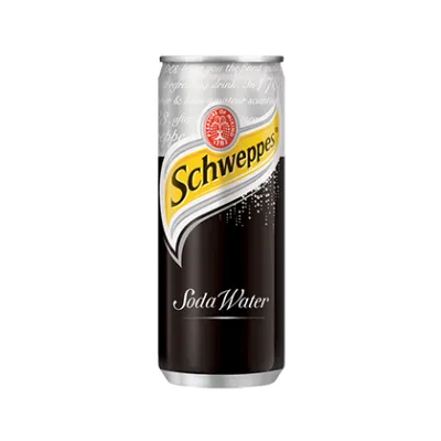 |
| Fig 1.11 Schweppes' Pacakging |
- Strengths: F&N is a well-known brand in Southeast Asia, with a strong market presence and loyal customer base. Typically positioned as a more affordable option compared to premium brands, making it accessible to a wider audience. On the other hand Schweppes is a globally recognized brand with a long history and strong market presence in many countries. It is perceived as a premium brand with high-quality products, often associated with superior taste and quality.
- Weaknesses: F&N is often viewed as a budget-friendly option, which may not appeal to consumers looking for premium products. Its packaging design is straightforward but lacks the premium feel that some consumers might prefer. On the other hand, Schweppes positioned as a premium product, which can be a barrier for price-sensitive consumers.
- Opportunities: F&N can start to expand into new markets within and outside of Southeast Asia. It also can introduces a premium line of soda water with enhanced packaging and flavor profiles could attract higher-end consumers. The brand should increase the use of recycled materials and promoting eco-friendly practices can enhance brand image.
- Risks: F&N's market share might be at risk due to Schweppes' strong brand and loyal customers. Competing with Schweppes, F&N needs to clearly highlight what makes its products special to stand out in the beverage market.
Exercise 02
 | ||
Fig 1.12 Final Prototype (Top View)
|

 |
| Fig 2.1 Final Dieline (Album) | JPEG |
 |
| Fig 2.2 Final Dieline (Body Mist) | JPEG |
Project 2: Innovative Packaging (Collaboration project with School of Biosciences) | Week 4 - Week 10 (23.05.2024 - 06.06.2024)
Fig 3.1 Presentation Slides | PDF
 |
| Fig 3.2 Dieline | JPEG |
 |
| Fig 3.3 Packaging Mockup #1 |
 |
| Fig 3.4 Packaging Mockup #2 |
Final Project: Merchandise and Promotional Strategy | Week 10 - Week 15 (06.06.2024 - 01.08.2024)
Final Merchandise Designs
 | ||||||
Fig 4.1 Final Pins Mockup Design | JPEG
|


Creating the Promotional Strategy
Fig 4.5 Promotional Strategy by Sorcha Griselda
Final Promotional Strategy Mockups
 |
| Fig 4.6 City Banner | JPEG |
 |
| Fig 4.7 Cargo Advertisement | JPEG |
REFLECTION
Experience
This class has been incredibly enlightening for me. Before taking it, I always wondered how packaging was created and what steps designers took to bring their ideas to life. This experience has deepened my appreciation for the various types of packaging I encounter daily, making me more aware of the creativity and effort involved in their creation.
Observation
Much of my inspiration in this class came from observing and analyzing existing packaging. This direct study was crucial in helping me understand how different designs are made. Initially, I struggled with grasping the concepts, but I made significant progress by dissecting various packages. By doing so, I identified the elements that made each one effective and distinctive in a subtle yet impactful way. This exercise highlighted how small details can make a big difference in the overall success of a packaging design.
Findings
Wow! The amount I have learned from this module seems endless. I have learned so much from the lectures and the hands-on processes of creating designs and forms. The knowledge I have gathered was so significant that I incorporated it into my dissertation, enhancing my understanding of a topic I have been passionate about for a long time. This class not only taught me the technical skills of packaging design but also enriched my appreciation for the artistry and strategy behind it. I am grateful for the chance to dive deeper into a topic I have always been interested in.


Comments
Post a Comment